Tuesday, September 25, 2012

Accordion Control Example – AJAX Control

It allows you to define multiple panes but displays only one pane at a time. It is a king of CollapsiblePanel Control. To define multiple panes in Accordion Control , we have to make use of “AccordionPane” Control. Each pane has its own template for its header and content.

Important attributes of this control are :

SelectedIndex : needs to specify Index of the pane that should be visible by default. (mandatory attribute for Accordion Control)

CssClass : specify a css class name that represents style for accordion control.

HeaderCssClass : specify a css class name that represents style for headers of AccordionPane Control.

ContentCssClass : specify a css class name that represents style for contents of AccordionPane Control

Example – Accordion Control

<%@ Page Language="C#" AutoEventWireup="true" CodeFile="Accordion Control.aspx.cs" 
Inherits="Ajax_Controls_Examples_Accordion_Control" %>


<!DOCTYPE html PUBLIC "-//W3C//DTD XHTML 1.0 Transitional
//EN"
"http://www.w3.org/TR/xhtml1/DTD/xhtml1-transitional.dtd">

<html xmlns="http://www.w3.org/1999/xhtml">
<head runat="server">
<title>Accordion Control</title>
<style type="text/css">
.accordion
{
padding: 5px;
font-family: 'Times New Roman' , Times, serif;
font-size: medium;
font-weight: normal;
font-style: normal;
font-variant: normal;
color: #000000;
background-color: #FFFFFF;
position: absolute;
width: 200px;
height: 173px;
top: 40px;
left: 10px;
}

.accordionheader
{
font-family: 'Times New Roman' , Times, serif;
font-size: large;
font-weight: bold;
font-style: normal;
color: #000000;
border: thin dotted #000000;
padding: inherit;
background-color: #CC6600;
width: 200px;
height: 30px;
}
.accordionContent
{
font-family: 'Times New Roman' , Times, serif;
font-size: small;
font-weight: bold;
font-style: italic;
color: #800000;
background-color: #FFFFCC;
width: 200px;
}


</style>
</head>
<body>
<form id="form1" runat="server">
<div>
<ajaxToolkit:ToolkitScriptManager ID="Sc1" runat="server">
</ajaxToolkit:ToolkitScriptManager>
<ajaxToolkit:Accordion id="Accordion1" runat="server" SelectedIndex="0"
HeaderCssClass="accordionheader" ContentCssClass="accordionContent"
CssClass="accordion">
<Panes>
<ajaxToolkit:AccordionPane ID="Pane1" runat="server">
<Header>
<asp:Label ID="lblHd1" runat="server" Text="Accordion Control"></asp:Label>

</Header>
<Content>
It allows you to define multiple panes
but displays only one pane at a time.
It is a king of CollapsiblePanel Control.
To define multiple panes in Accordion Control
, we have to make use of “AccordionPane” Control.
Each pane has its own template for its header and content.
</Content>
</ajaxToolkit:AccordionPane>

<ajaxToolkit:AccordionPane id="pane2" runat="server">
<Header>
<asp:Label ID="Label1" runat="server" Text="Accordion Pane"></asp:Label>
</Header>
<Content>
It allows you to define multiple panes
but displays only one pane at a time.
It is a king of CollapsiblePanel Control.
To define multiple panes in Accordion Control
, we have to make use of “AccordionPane” Control.
Each pane has its own template for its header and content.
</Content>
</ajaxToolkit:AccordionPane>
<ajaxToolkit:AccordionPane ID="Pane3" runat="server">
<Header>
<asp:Label ID="Label3" runat="server" Text="Header Styles"></asp:Label>
</Header>
<Content>
It allows you to define multiple panes
but displays only one pane at a time.
It is a king of CollapsiblePanel Control.
To define multiple panes in Accordion Control
, we have to make use of “AccordionPane” Control.
Each pane has its own template for its header and content.
</Content>

</ajaxToolkit:AccordionPane>
</Panes>
</ajaxToolkit:Accordion>
</div>
</form>
</body>
</html>

Output :


1)Output on page load


2)output on click of “Accordion Pane” tab


3)output on click of “Header Styles” tab.


Accordion_Op1


Accordion_op2


Accordion_op3

HoverMenuExtender Example – Ajax Control


Introduction :

It shows the hidden control when user hovers on the target control. We can say tooltip displayed for links as an example of this control.

Two main attributes we need to specify for this control are “TargetcontrolId” and “PopupControlid”.

TargetControlId: Control on which user hovers to see the hidden control.

PopupControlId: hidden control which is visible after user hovers on the target control.

We can specify “PopupDelay” , “offsetX” , “OffsetY” for the hidden control .

Example – HoverMenuExtender

Create a label and on mouse hover on that label , show panel as popup.

<html xmlns="http://www.w3.org/1999/xhtml">
<head runat="server">
<title>HoverMenuExtender</title>
</head>
<body>
<form id="form1" runat="server">
<div>
<ajaxToolkit:ToolkitScriptManager ID="Sc1" runat="server">
</ajaxToolkit:ToolkitScriptManager>
<asp:Label ID="lblMsg" runat="server" Text="Click Me!!"
ForeColor="Blue" Font-Underline="True" >
</asp:Label>
<asp:Panel ID="Pn1" runat="server" BorderColor="Red" BorderWidth="2">
<asp:Label ID="lblPopUp" runat="server"
Text ="This is a label not a Hyperlink!!!!" >
</asp:Label>
</asp:Panel>
<ajaxToolkit:HoverMenuExtender ID="HoverMenuExtender1" runat="server"
TargetControlID="lblMsg" PopupControlID="Pn1"
PopupPosition="Right" OffsetX="20" OffsetY="20">
</ajaxToolkit:HoverMenuExtender>
</div>
</form>
</body>
</html>

Output :


HovermenuExtender_op1


HoverMenuExtender_op2

DropShadowExtender – Ajax Control


It is used to add a shadow for any control.

Code to add Shadow to an Image Control using DropShadowExtender :


<html xmlns="http://www.w3.org/1999/xhtml">
<head runat="server">
<title>DropShadow - Ajax Control</title>
</head>
<body>
<form id="form1" runat="server">
<div>
<ajaxToolkit:ToolkitScriptManager ID="Sc1" runat="server">
</ajaxToolkit:ToolkitScriptManager>
<asp:Image ID="ImgDisplay" runat="server" ImageUrl="~/Images/3.jpeg"
Width="200" Height="200"/>
<ajaxToolkit:DropShadowExtender ID="DropShadowExtender1" runat="server"
TargetControlID="ImgDisplay" Rounded="true" Width="10">
</ajaxToolkit:DropShadowExtender>
</div>
</form>
</body>
</html>

Output :


DropShadow

PasswordStrength Example - AJAX Control


Introduction :

This control evaluates the strength of the password entered and also displays a message to the end user about the password strength .

Example – PasswordStrength


<html xmlns="http://www.w3.org/1999/xhtml">
<head runat="server">
<title>PasswordStrengthControl Extender</title>
</head>
<body>
<form id="form1" runat="server">
<div>
<ajaxToolkit:ToolkitScriptManager ID="Sc1" runat="server">
</ajaxToolkit:ToolkitScriptManager>

Enter Password:<asp:TextBox ID="txtPassword" runat="server" TextMode="Password" >
</asp:TextBox>
<br />
<br />
<ajaxToolkit:PasswordStrength ID="PasswordStrength1" runat="server"
TargetControlID="txtPassword" >
</ajaxToolkit:PasswordStrength>


</div>
</form>
</body>
</html>

Output :


PasswordStrength_op1


PasswordStrength_op2 


PasswordStrength_op3

AutoCompleteExtender – AJAX Control


Introduction :

It is a feature that helps end user when typing for a word in a search box. We can say Google Search box as live example for this. When we start typing “java” in the search box , it gives a list of all searches (that we made earlier or other user had made ) containing “Java” as prefix. Now a days this feature is available in almost all the search engine sites.

This feature extends the functionality of the textbox.

Important attributes of this control , that needs to be specified are

TargetControlID : Textbox ID to which autocomplete functionality needs to be added.

ServiceMethod : Functions which fetches data based on the  text (takes prefix) typed in the database.

Example – AutoCompleteExtender :

Step 1 : Register AjaxControlToolkit.

<%@ Register assembly="AjaxControlToolkit" namespace="AjaxControlToolkit" tagprefix="ajaxToolkit" %>

Step 2 : Add ToolKitScriptManager to the page.


<ajaxToolkit:ToolkitScriptManager ID="Sc1" runat="server">
</ajaxToolkit:ToolkitScriptManager>

Step 3: Add textbox and AutoCompleteExtender to the page. Assign textbox ID to “TargetControlID” attribute. Define some SeriveMethod and set “EnableCaching” to true.


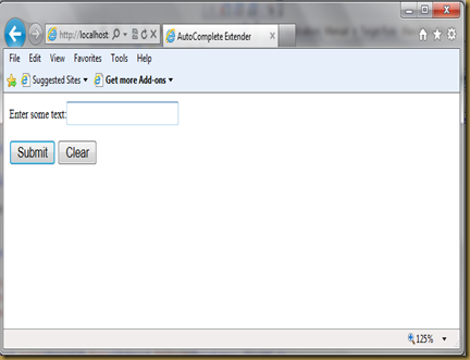
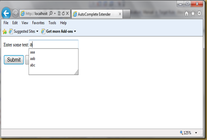
If we set “EnableCaching” to true , then no need to define any functionality for ServiceMethod . Whatever user types in the textbox will be shown as autocomplete text. Suppose say user first types “aa” and submits  and next when he start typing a , it will show “aa” as a dropdown list under the textbox.


<html xmlns="http://www.w3.org/1999/xhtml">
<head runat="server">
<title>AutoComplete Extender</title>
</head>
<body>
<form id="form1" runat="server">
<div>
<ajaxToolkit:ToolkitScriptManager ID="Sc1" runat="server">
</ajaxToolkit:ToolkitScriptManager>
Enter some text:<asp:TextBox ID="txtdata" runat="server">
</asp:TextBox>
<br /> <br />
<asp:Button ID="btnSubmit" runat="server" Text="Submit" OnClick="btnSubmit_Click" />
<asp:Button ID="btnClear" runat="server" Text="Clear" OnClick="btnClear_Click"/>
<ajaxToolkit:AutoCompleteExtender ID="AutoCompleteExtender1"
runat="server" TargetControlID="txtdata"
ServiceMethod="DisplayText"
EnableCaching="true" >
</ajaxToolkit:AutoCompleteExtender>
</div>
</form>
</body>
</html>


 protected void btnSubmit_Click(object sender, EventArgs e)
{
Response.Write("Page is Submitted");

}
protected void btnClear_Click(object sender, EventArgs e)
{
txtdata.Text = "";

}

public string[] DisplayText(string PrefixText, int Count, string ContextKey)
{
return new string[] { string.Empty };
}

Output :


AutoCompleteExtender_Op1


AutoCompleteExtender_Op2

CollapsiblePanelExtender – AJAX Control


Introduction :

To collapse or expand a panel we can use this control. The target control will be collapsed when CollapseControlId control is clicked and expanded when ExpandControlid is clicked. We can also write message to a textbox or label when target control is collapsed or expanded using CollapsedText / ExpandedText .

Three main attributes of this control , for which we need to assign values are

TargetControlID : Target Control which needs to be collapsed and expanded. 

CollapSeControlID : Control on whose click target control is collapsed.

ExapndControlID: Control on whose click target control is expanded.

Example using CollapsiblePanelExtender :

Step 1 : Register AjaxControlToolKit.

<%@ Register assembly="AjaxControlToolkit" namespace="AjaxControlToolkit" tagprefix="ajaxToolkit" %>

Step 2 : Add ToolKitScriptManager to the page.


<ajaxToolkit:ToolkitScriptManager ID="Sc1" runat="server">
</ajaxToolkit:ToolkitScriptManager>

Step 3 : Add a panel and add two buttons to the page, one for collapsing the panel and other for expanding the panel.


Step 4 : Add CollapsiblePanelExtender and assign panel ID to the “TargetControlID” . Assign One button Id to “CollapseControlID” and other button Id to “ExpandControlID”


<html xmlns="http://www.w3.org/1999/xhtml">
<head runat="server">
<title>CollapsiblePanelExtender</title>
</head>
<body>
<form id="form1" runat="server">
<div>
<ajaxToolkit:ToolkitScriptManager ID="Sc1" runat="server">
</ajaxToolkit:ToolkitScriptManager>
<asp:Button ID="btnCollapse" runat="server" Text="Click to Collapse" />
<asp:Button ID="btnExpand" runat="server" Text="Click to Expand" />
<br />

<asp:Panel ID="panel1" runat="server" Height="115px" BorderWidth="1" Width="265px" >
<asp:Label id="lblText" runat="server" Text="Collapsible panel Example
To collapse or expand a panel we can use this control. The target control will be
collapsed when CollapseControlId control is clicked and expanded
when ExpandControlid is clicked.We can also write message to a
textbox or label when target controlis collapsed or expanded
using CollapsedText / ExpandedText ."

ForeColor="Maroon">
</asp:Label>
</asp:Panel>
<ajaxToolkit:CollapsiblePanelExtender ID="CollapsiblePanelExtender1" runat="server"
TargetControlID="Panel1" CollapseControlID="btnCollapse" ExpandControlID="btnExpand"
ExpandedSize="100" CollapsedSize="10" SuppressPostBack="true" >
</ajaxToolkit:CollapsiblePanelExtender>
</div>
</form>
</body>
</html>

Output :


CollapsiblePanelExtender_op1


 CollapsiblePanelExtender_op2              CollapsiblePanelExtender_op3

Monday, September 24, 2012

ColorPickerExtender–AJAX Control


Introduction :

This extender allows end user to pick a color from the popup panel of colors. If end user wants to select a color other than the basic color , for example say he wants to select either darker shade or lighter shade of a color ,it wont be possible if we provide a dropdown list with basic colors( red, green ,blue...). So to achieve this we can use ColorPickerExtender which allows end user to select color from the popup panel of colors.

Example using ColorPickerExtender:

Step 1 : Register AjaxControlToolKit.

<%@ Register assembly="AjaxControlToolkit" namespace="AjaxControlToolkit" tagPrefix="ajaxToolkit" %>

Step 2 : Add ToolKitScriptManager to the page.


<ajaxToolkit:ToolkitScriptManager ID="Sc1" runat="server">
</ajaxToolkit:ToolkitScriptManager>

Step 3 : Drag and drop a textbox.


Step 4 : Add ColorPickerExtender and assign textbox ID to the “TargetControlID” .


<html xmlns="http://www.w3.org/1999/xhtml">
<head runat="server">
<title>Color Picker Extender</title>
</head>
<body>
<form id="form1" runat="server">
<div>
<ajaxToolkit:ToolkitScriptManager ID="Sc1" runat="server">
</ajaxToolkit:ToolkitScriptManager>
Pick your favourite Color:<asp:TextBox ID="txtColor" runat="server" >
</asp:TextBox>
<br /> <br />
<ajaxToolkit:ColorPickerExtender ID="ColorPickerExtender1" runat="server"
TargetControlID="txtDate" >
</ajaxToolkit:ColorPickerExtender>

</div>
</form>
</body>
</html>

When textbox gets focus , a popup appears near textbox which allows user to select a color. After selection popup disappears and hexadecimal code of the selected color is seen as text in the textbox.

ConfirmButtonExtender–AJAX Control


Introduction :

It is used to reconfirm the users action. For example in some forms if user is clicking on delete / submit button a reconfirmation dialogue box appears prompting the user if he wants to do this action or not .

Example – ConfirmButtonExtender :

Step 1 : Register AjaxControlToolkit.

<%@ Register assembly="AjaxControlToolkit" namespace="AjaxControlToolkit" tagPrefix="ajaxToolkit" %>

Step 2 : Add ToolKitScriptManager to the page.


<ajaxToolkit:ToolkitScriptManager ID="Sc1" runat="server">
</ajaxToolkit:ToolkitScriptManager>

Step 3 : Add a button and name it “Submit”.


Step 4 : Add ConfirmbuttonExtender and assign button ID to “TargetControlID” of this control.


<html xmlns="http://www.w3.org/1999/xhtml">
<head runat="server">
<title>ConfirmButtonExtender</title>
</head>
<body>
<form id="form1" runat="server">
<div>
<ajaxToolkit:ToolkitScriptManager ID="Sc1" runat="server">
</ajaxToolkit:ToolkitScriptManager>
<asp:Button ID="btnSubmit" runat="server" Text="Submit"
OnClick="btnSubmit_Click" style="height: 26px" />
<ajaxToolkit:ConfirmButtonExtender ID="ConfirmbuttonExtender1" runat="server"
TargetControlID="btnSubmit" ConfirmText="Are you sure you want to submit???">
</ajaxToolkit:ConfirmButtonExtender>

</div>
</form>
</body>
</html>

If user clicks on Ok then the functionality written for click of submit button will be executed. If user clicks on Cancel , dialogue box closes and  nothing happens.


Output :


ConfirmButtonExtender


ConfirmButtonExtender_Op2

CalendarExtender–AJAX Control


Introduction :

Now a days there are many forms on the internet where end user has to enter a date. It is very easy to provide Calendar tool to the user using this extender. CalendarExtender by default provides JavaScript functionality to convert selected date into different formats.

CalendarExtender also extends the functionality of textbox.

Example using CalendarExtender:

Step 1 : Register AjaxControlToolKit.

<%@ Register assembly="AjaxControlToolkit" namespace="AjaxControlToolkit" tagPrefix="ajaxToolkit" %>

Step 2 : Add ToolKitScriptManager to the page.


<ajaxToolkit:ToolkitScriptManager ID="Sc1" runat="server">
</ajaxToolkit:ToolkitScriptManager>

Step 3 : Drag and drop a textbox .


Step 4 : Now add CalendarExtender to the page and assign the textbox id to TargetControlID attribute.


<html xmlns="http://www.w3.org/1999/xhtml">
<head runat="server">
<title>Calendar Extender</title>
</head>
<body>
<form id="form1" runat="server">
<div>
<ajaxToolkit:ToolkitScriptManager ID="Sc1" runat="server">
</ajaxToolkit:ToolkitScriptManager>
Enter Date:<asp:TextBox ID="txtDate" runat="server" ReadOnly="true">
</asp:TextBox>
<br /> <br />
<ajaxToolkit:CalendarExtender ID="CalendarExtender1" runat="server"
TargetControlID="txtDate" >
</ajaxToolkit:CalendarExtender>
</div>
</form>
</body>
</html>

As soon as user tries to enter date in the textbox , Calendar pops up and user can select a date.We can specify the format of date to be shown in the textbox using “format” attribute of this control.


Output :


CalendarExtender_op1


CalendarExtender_op2

AlwaysVisibleControlExtender Example–AJAX Control ToolKit


Introduction

Sometimes user wants to view certain portion of the page even when he scrolls or resizes the window. To get this functionality, we can use “AlwaysVisibleControlExtender”. We can specify a position to the portion of that page using this control and user when scrolls or resizes the window that portion of the page will always be visible.

Example using AlwaysVisibleControlExtender :

Step 1 : Register AjaxControlToolKit.

<%@ Register assembly="AjaxControlToolkit" namespace="AjaxControlToolkit" tagPrefix="ajaxToolkit" %>

Step 2 : Add ToolKitScriptmanager to the page.

<ajaxToolkit:ToolkitScriptManager ID="Sc1" runat="server">
</ajaxToolkit:ToolkitScriptManager>

Step 3 : Add many labels to the page , so that the page takes scrollbar.


Step  4: Now drag and drop a panel from the toolbox and add a label and a button to the panel.


Step 5 : Now add AlwaysVisibleControloExtender and assign Panel Id to the “TargetControlId” of this control.


<html xmlns="http://www.w3.org/1999/xhtml">
<head runat="server">
<title>Always Visible Control Extender</title>
</head>
<body>
<form id="form1" runat="server">
<div >
<ajaxToolkit:ToolkitScriptManager ID="Sc1" runat="server">
</ajaxToolkit:ToolkitScriptManager>

<asp:Label ID="Label1" runat="server" Text="Line : 1"></asp:Label>
<br />
<br />
<asp:Label ID="Label2" runat="server" Text="Line : 2"></asp:Label>
<br />
<br />
<asp:Label ID="Label3" runat="server" Text="Line : 3"></asp:Label>
<br /><br />
<asp:Label ID="Label4" runat="server" Text="Line : 4"></asp:Label>
<br /><br />
<asp:Label ID="Label5" runat="server" Text="Line : 5"></asp:Label>
<br /><br />
<asp:Label ID="Label6" runat="server" Text="Line : 6"></asp:Label>
<br /><br />
<asp:Label ID="Label7" runat="server" Text="Line : 7"></asp:Label>
<br /><br />
<asp:Label ID="Label8" runat="server" Text="Line : 8"></asp:Label>
<br /><br />
<asp:Label ID="Label9" runat="server" Text="Line : 9"></asp:Label>
<br /><br />
<asp:Label ID="Label10" runat="server" Text="Line : 10"></asp:Label>
<br /><br />
<asp:Label ID="Label11" runat="server" Text="Line : 11"></asp:Label>
<br /><br />
<asp:Label ID="Label12" runat="server" Text="Line : 12"></asp:Label>
<br /><br />
<asp:Label ID="Label13" runat="server" Text="Line : 13"></asp:Label>
<br /><br />
<asp:Label ID="Label14" runat="server" Text="Line : 14"></asp:Label>
<br /><br />
<asp:Label ID="Label15" runat="server" Text="Line : 15"></asp:Label>
<br /><br />
<asp:Label ID="Label16" runat="server" Text="Line : 16"></asp:Label>
<br /><br />
<asp:Label ID="Label17" runat="server" Text="Line : 17"></asp:Label>
<br /><br />
<asp:Label ID="Label18" runat="server" Text="Line : 18"></asp:Label>
<br /><br />
<asp:Label ID="Label19" runat="server" Text="Line : 18"></asp:Label>
<br /><br />
<asp:Label ID="Label20" runat="server" Text="Line : 20"></asp:Label>
<br /><br />
<asp:Label ID="Label21" runat="server" Text="Line : 21"></asp:Label>
<br /><br />
<asp:Label ID="Label22" runat="server" Text="Line : 22"></asp:Label>
<br /><br />
<asp:Label ID="Label23" runat="server" Text="Line : 23"></asp:Label>
<br /><br />
<asp:Label ID="Label24" runat="server" Text="Line : 24"></asp:Label>
<br /><br />
<asp:Label ID="Label25" runat="server" Text="Line : 25"></asp:Label>
<br /><br />
<asp:Label ID="Label26" runat="server" Text="Line : 26"></asp:Label>
<br /><br />
<asp:Label ID="Label27" runat="server" Text="Line : 27"></asp:Label>
<br /><br />
<asp:Label ID="Label28" runat="server" Text="Line : 28"></asp:Label>
<br /><br />
<asp:Label ID="Label29" runat="server" Text="Line : 29"></asp:Label>
<br /><br />
<asp:Label ID="Label30" runat="server" Text="Line : 30"></asp:Label>
<br /><br />
<asp:Label ID="Label31" runat="server" Text="Line : 31"></asp:Label>
<br /><br />
<asp:Label ID="Label32" runat="server" Text="Line : 32"></asp:Label>
<br /><br />
<asp:Label ID="Label33" runat="server" Text="Line : 33"></asp:Label>
<br /><br />
<asp:Label ID="Label34" runat="server" Text="Line : 34"></asp:Label>
<br /><br />
<asp:Label ID="Label35" runat="server" Text="Line : 35"></asp:Label>
<br /><br />


<asp:Panel ID="panel1" runat="server" BorderColor="Red" BorderStyle="Solid"
BorderWidth="2px" Height="200px" Width="200px" >
<asp:Label ID="lblMsg" runat="server"
Text="
THIS PANEL IS ALWAYS VISIBLE
EVEN WHEN USER SCROLLS OR RESIZES THE WINDOW"
Font-Italic="False"
ForeColor="Blue"></asp:Label>
<br /> <br />
<asp:Button id="btnSubmit" runat="server" Text="Submit" />
</asp:Panel>
<br />
<ajaxToolkit:AlwaysVisibleControlExtender
ID="AlwaysVisibleControl1" TargetControlID="Panel1" runat="server"
HorizontalOffset="20" VerticalOffset="20" HorizontalSide="Right"
VerticalSide="Top">
</ajaxToolkit:AlwaysVisibleControlExtender>

</div>
</form>
</body>
</html>

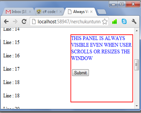
Here We have assigned panel to the TargetControlID , so even when the user scrolls the page or resizes the page , panel control will be visible.


We can set the position of this target control using  HorizontalOffset and VerticalOffset attributes.


Output:


AlwaysVisibleExtender_OP